Pantone colors are standardized, named colors used in design and printing so that the same color can be reproduced consistently across different materials, printers, and locations. When someone specifies “Pantone 186 C,” they are referring to a precise color from the Pantone Matching System, not a generic red.

What Is Pantone?
Pantone is a company best known for the Pantone Matching System (PMS), a standardized color system used in graphic design, printing, packaging, fashion, and product design. The core goal is consistency: if a designer specifies a Pantone color, a printer elsewhere should be able to reproduce that color reliably using Pantone guides and inks.
Instead of relying only on CMYK percentages (which can vary across presses and papers), Pantone provides physical swatch books and mixing formulas for specific spot colors. These guides act as a shared reference for designers, brands, and print providers.
What Are Pantone Colors?
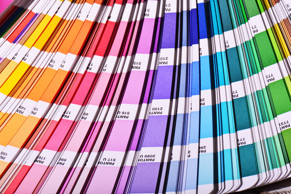
A Pantone color is a specific, standardized color defined in the Pantone Matching System. Each color appears as a solid swatch in a Pantone guide book and is identified by a unique number and suffix. These colors are typically printed as spot colors, meaning they use pre-mixed inks instead of being built from CMYK on press.
In practice, this means that instead of instructing a printer to output something like 0% cyan, 100% magenta, 100% yellow, 0% black, you can specify “Pantone 186 C.” The printer then uses the corresponding Pantone ink formula to match the reference swatch as closely as possible.
How Pantone Color Codes Work
Pantone colors are usually referenced by a number followed by one or more letters indicating the intended substrate or application. Examples include:
- Pantone 186 C
- Pantone 300 U
In these codes, the number (for example 186 or 300) identifies the specific color in the Pantone system. The letter indicates the type of paper or finish:
- C = Coated paper (typically glossy or semi-gloss)
- U = Uncoated paper
Pantone also uses additional suffixes in some libraries (such as CP and UP for certain digital or process guides), but C and U are the most common in standard spot color books.


The same Pantone number can look different on coated versus uncoated stock because the paper absorbs and reflects ink differently. Pantone provides separate swatches for each surface so expectations stay accurate for each print condition.
Pantone Spot Colors vs CMYK Process Colors
In printing, there are two primary approaches to color:
- Spot color printing uses pre-mixed inks, such as Pantone colors, applied as their own separate inks.
- Process color printing uses CMYK (cyan, magenta, yellow, black) inks layered in different percentages to simulate many colors.
Pantone colors are typically used as spot colors. They are mixed to a specific formula before they ever reach the press. Spot colors are ideal when consistent brand colors are required, when a design uses only a few solid colors, or when specialty inks such as metallics or fluorescents are needed.
CMYK is used for full-color imagery, gradients, and photos. Many Pantone colors can be approximated using CMYK builds, but not all can be matched accurately due to differences in color gamut.

Real-World Pantone Brand Examples
Many well-known brands specify Pantone colors in their brand guidelines to keep their visual identity consistent across packaging, signage, and printed materials.
- Coca-Cola red is specified in brand standards via a Pantone red so that cans, cartons, and outdoor signage all match, even when they are printed by different vendors.
- UPS brown is defined as a specific Pantone brown used on trucks, uniforms, and packaging, making the color instantly recognizable regardless of print process.
- Tiffany & Co. famously uses a proprietary “Tiffany Blue,” historically referenced to a specific Pantone swatch in their internal standards to keep boxes, bags, and ads visually consistent.
- Many sports teams define their team colors as Pantone values (for example, a specific Pantone blue and gold) so jerseys, merchandise, and arena signage all align.
The exact Pantone numbers for some of these brands are controlled through their own brand guidelines and licensing agreements, but the underlying idea is the same: Pantone provides a physical color reference that printers can match anywhere in the world.
Pantone vs RGB, HEX, and CMYK
Pantone, CMYK, RGB, and HEX each belong to different parts of design and production workflows. Pantone and CMYK are ink-based systems, while RGB and HEX are digital color systems based on emitted light.
| System | Medium | Type | Typical Use |
|---|---|---|---|
| Pantone | Ink on physical materials | Spot colors (pre-mixed inks) | Brand colors, logos, specialty inks |
| CMYK | Ink on physical materials | Process colors | Full-color print, photos, general print work |
| RGB | Screens and displays | Additive light model | Web, apps, digital interfaces |
| HEX | Screens and web | Hexadecimal notation for RGB | Web styling, CSS, design systems |
Because these systems have different gamuts and rely on different technologies, conversions between them are approximate rather than exact.
Converting Pantone to HEX or RGB
Most design tools include Pantone-to-RGB and Pantone-to-HEX conversions so digital mockups can visually align with printed brand colors. These conversions are approximations because some Pantone colors lie outside the RGB gamut and cannot be displayed perfectly on screens.
In addition, the appearance of a Pantone color on screen depends on monitor calibration, color profiles, and display brightness. Pantone’s official conversion tables are also proprietary, so not all tools provide the exact same values.
Use Pantone-to-HEX and Pantone-to-RGB conversions as helpful guides for digital design, but rely on physical Pantone swatches and printed proofs for final decisions.
Common Pitfalls
- Expecting a Pantone color to look identical across coated and uncoated papers
- Assuming a HEX or RGB value can perfectly match a Pantone ink
- Using CMYK approximations for Pantone colors without checking printed proofs
- Trusting unofficial or outdated conversion charts
- Overlooking licensing limitations in design software
Pantone and Digital Tools Like Swatch.ing
Many workflows begin with digital colors such as HEX, RGB, or HSL. Once a direction is chosen, the next step is determining how those colors should appear in Pantone or CMYK for print production. Tools like Swatch.ing can help establish a starting point.
Swatch.ing can extract digital colors from images, generate palettes that approximate a desired tone, and prepare designers for conversations about Pantone equivalents with printers or brand teams. The final Pantone choice, however, should always be verified using official swatches and printed proofs.
Licensing and Access to Pantone Libraries
Pantone’s digital libraries are proprietary and subject to licensing agreements. Some design applications include Pantone libraries by default, while others require additional licensing or plug-ins. Regardless of how they are accessed, Pantone libraries exist to ensure that everyone in the design and production process is referencing the same standardized colors.
Applying Pantone in Practice
Understanding how Pantone fits alongside RGB, HEX, and CMYK provides more control over how colors appear on screen and in print. Use Pantone for brand-defining colors that must remain consistent, use CMYK for full-color printing, and use RGB or HEX for digital design work.
- Use Pantone for precise, repeatable brand colors
- Use CMYK for full-color photos, gradients, and general print runs
- Use RGB and HEX for digital applications, aligning them to Pantone values when needed
- Review physical proofs against Pantone swatches before approving print production
By treating Pantone as a shared reference system, designers, printers, and manufacturers can communicate more clearly and produce consistent results across all materials.