Color Basics
-

What Is Color Harmony? The Basics Explained
Understanding Color Harmony Color harmony describes how colors relate to each other in a palette to create balance, clarity, and visual stability. When colors harmonize, the design feels…
-
Understanding Neutral Colors (Warm, Cool, Balanced)
What Are Neutral Colors? Neutral colors are low-chroma hues that appear subdued or colorless, ranging from true grays to muted versions of browns, blues, greens, and other tones.…
-
Additive vs Subtractive Color: How Mixing Works
Understanding Additive and Subtractive Color Models Additive and subtractive color models describe how color is formed through either light emission or light absorption. Digital screens create color by…
-
What Is Color Value and Why Does It Matter?
Understanding Color Value in Design Color value is a fundamental concept in color theory that influences how a color appears and interacts with others. It refers to the…
-
Why Colors Look Different on Every Screen
Understanding Color Consistency Across Devices Have you ever noticed that the same image looks different on your phone, laptop, and desktop monitor? This discrepancy in color display can…
-
What Is a Color Palette? Beginner’s Guide
Understanding the Concept of a Color Palette A color palette refers to a set of chosen colors that are used in a design project. This selection of colors…
-
How Light Affects Color: A Beginner’s Guide to Perception
The Basics of Light and Color Perception Color perception is fundamentally influenced by light; it is the medium through which colors are seen and interpreted. When light strikes…
-
Primary, Secondary, and Tertiary Colors Explained
Understanding Primary Colors Primary colors are the starting points for building all other colors, but which colors count as “primary” depends on the system you are working in.…
-
High-Key vs Low-Key Colors: Understanding Light and Dark
The Basics of High-Key and Low-Key Colors In color theory, high-key and low-key colors offer a fascinating way to understand the use of light and dark in design.…
-
Tints, Shades, and Tones
Tints, shades, and tones are simple but powerful ideas in color theory. They all start with the same thing—a base color—and then change it by adding white, black,…
-

What Are Pantone Colors? The Pantone Matching System Explained
Pantone colors are standardized, named colors used in design and printing so that the same color can be reproduced consistently across different materials, printers, and locations. When someone…
-
What Is Color Temperature? Warm vs Cool Explained
Color temperature describes whether light appears visually warm (more yellow/red) or cool (more blue). It influences how spaces feel, how photos look, and how accurately colors are perceived.…
-

What are CMYK colors? CMYK vs RGB and Why Print Looks Different
CMYK is the color model used for print, while RGB is used for screens. Designs that look vivid on a monitor in RGB can appear duller or slightly…
-
What are HSL colors? Understanding Hue, Saturation, and Lightness
HSL describes color using three components that match how we tend to think about it: hue (which color), saturation (how intense), and lightness (how light or dark). Instead…
-
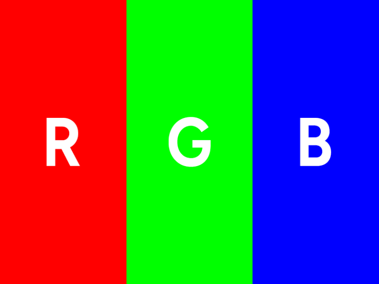
What are RGB colors? A Beginner-Friendly Guide (With RGBA Explained)
Digital displays create color using three light channels: red, green, and blue. Each pixel contains subpixels for these channels, and RGB values such as rgb(52, 152, 219) describe…
-

What are HEX Colors? A Simple Guide for Beginners
HEX colors are one of the most common ways to define color on the web. If you have edited CSS or used a design tool, you have likely…